Screen Color Calibration Totally F-ed Up


thenext1

Members
Mar 9, 2016
46
18
Hello I have bought a Redmi Pro to accompany my other Mi5, interested in the metal body and oled screen. The latter one is almost a disaster.
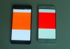
The first issue is a strong green tinge that makes red look orange. I've took a photo with my digital camera (attached) to illustrate the first thing, on the left is the Redmi Pro and opposite is my other Mi5. You can see with your eyes, it's distinctly orange. Also it's not as vivid as the Mi5's red. (I don't think of comparing it to a Samsung or Nokia amoled red).
No option in the color settings solves this issue.

The second issue is the extra strong contrast curve that darkens all midtones. Looking at the facebook icon on a bright background, or any other icon/text with a pastel tone (not vivid), becomes colorless, like black and white. The Mi5 is wonderful in comparison, even being an LCD.

are you as bothered from this as me?
i will post this on miui's forum and i hope it's not a panel "characteristic"
 

Attachments

  • PB230365-1.jpg
    PB230365-1.jpg
    277.4 KB · Views: 2,406
I have to agree with you that some of the colours come up alittle odd on the oled display of the redmi pro. Some colours are alittle off from the original but mine is nowhere as bad as yours when it comes to displaying red. If you goto settings and select 'about phone' and tap on 'kernel version' multiple times, you can enter the self diagnostic application to test out the screen and it will also toggle through the primary colours of the display and you can judge if the rest of the colours are way off the mark.
 
Did you compare it with a "reference" display (like Samsung/nokia oled or mi 5, or...)?
Our eyes can see the difference very well, but shooting it with a digital camera is difficult as the difference comes out very subtle (due to internal camera processing and levelling), and when you look it on your laptop screen it's near to non-existant. So I had to process the photo a bit. But I assure you the difference is there and very noticeable with the naked eye.
Also not only the red is off mark to orange, but intermediate shades of all colors are darker than they should be.
For example the WhatsApp green bar is darker on the Redmi pro than was on the Mi 5 or any other screen.
The blue message bubbles on FB Messenger are deeper than they used to be.
And so on, and so on.
I hope this is due to Xiaomi's inexperience with OLED screens and not to the Redmi Pro's OLED panel being crap :)
 
I compared it against a regular LCD on my Asus Zenfone 3 5.5 which has a pretty good LCD display. The difference on the whatsapp icon and green borders within the app is pretty obvious. That was the 1st thing i noticed when I got the phone. The green on the oled display of the redmi pro seems much darker and to me appears to be like 'dirty' green. Orange also seems 'faded' compared to the display on the Asus. Something not related to colour reproduction which I wanted to highlight is the touch screen sensitivity. Somehow it does not seem to be as sensitive to touch compared to other more premium brands. The double tap to wake function also seems flaky as I've realised that if the phone is in standby for a long while, the double tap to wake doesn't seem to work. You will need to power up the screen by depressing the physical buttons. However, this could just be a software bug.
 
Orange seems faded too.
In fact, even at the "vividest" setting, the colors are muted, somewhat LCD-like.
I expected brighter colors from a display that Xiaomi claims to cover 100% of NTSC.
But I don't think they lied on the spec sheet... more like they've messed up the calibration somehow.

I have no issues regarding the touchscreen sensitivity or double tap to wake (which I don't use).
 
That's pretty bad. I'm recieving mine this week, and I hope my screen is at least acceptable. I come from a Galaxy Note 5 (screen broke after 1 year) so I hope I won't notice the difference too much.
 
That's pretty bad. I'm recieving mine this week, and I hope my screen is at least acceptable. I come from a Galaxy Note 5 (screen broke after 1 year) so I hope I won't notice the difference too much.
Don't worry, the color differences in the red image are "enhanced".
You will notice another subtlety instead, look at the below image... a friend's Galaxy A3 on the left and my Redmi Pro on the right, about same screen brightness and "natural" setting on the Redmi.
Notice how the green bar is almost black, and (as result) colors are much less vivid on the Redmi. On the left is the whatsapp green color we're obviously used to. This also happens with facebook and all pastel colors.
I think they've just gone overboard with the display's gamma correction... should be easily fixable (by them).

IMG-20161127-WA0009.jpg
 
  • Like
Reactions: stevedat
At first I found the colors a bit off, but have totally adapted now. I enjoy the display every time I pick it up.

The issue I've found is that it's not smooth. Look closely you'll see a lot of jaggies in normal sized text. I've seen smoother 720p displays, no joke. This could be partially why the Mi5 looks better to you. Mi5 is about as smooth as it gets.

This is just the tech they use in Redmi Pro though - A cheaper OLED. Colorwise I'm fine with it...They're deeper and richer than any LCD I've seen...it's a $200 phone, and difficult to expect more.
 
The issue I've found is that it's not smooth. Look closely you'll see a lot of jaggies in normal sized text. I've seen smoother 720p displays, no joke.
Because of:
1) the different pixel arrangement of Redmi Pro's display... not Pentile and possibly not as sophisticated as Pentile to visually trick the eye
2) the fact that the gray shades in glyph outlines are pushed to black (too high gamma), giving text too sharp and jagged

At first I found the colors a bit off, but have totally adapted now. I enjoy the display every time I pick it up.
[...]
This is just the tech they use in Redmi Pro though - A cheaper OLED. Colorwise I'm fine with it...They're deeper and richer than any LCD I've seen...it's a $200 phone, and difficult to expect more.
I enjoy the screen too.
Contrast and saturation wise it's definitely better than any LCD screen, on par with the best LCDs (like Apple's).
But it's a $200 phone with color calibration terribly off, and it should cost them $1 to adjust the gamma curves it in a firmware update.
 
Because of:
1) the different pixel arrangement of Redmi Pro's display... not Pentile and possibly not as sophisticated as Pentile to visually trick the eye
2) the fact that the gray shades in glyph outlines are pushed to black (too high gamma), giving text too sharp and jagged


I enjoy the screen too.
Contrast and saturation wise it's definitely better than any LCD screen, on par with the best LCDs (like Apple's).
But it's a $200 phone with color calibration terribly off, and it should cost them $1 to adjust the gamma curves it in a firmware update.
The color looks fine to me. I think you're just wishfully thinking it's something that can be easily fixed. They're likely using the drivers provided by the manufacturer of the display, unless you think the manufacturer also doesn't know what they're doing. Possible, but unlikely.

I've compared to Samsung and such. Not a big difference other than the jaggies.

Maybe you got a lemon.
 
I think on low light the white balance is quite wrong, it goes quite blue. Too bad it cannot be set in small increments, just as cold/normal/warm.
 
I've set the color & contrast on standard. Think it looks better on that setting. But everyone has their own opinion/preference
 
I recieved mine and yeah it's very bad. The text is jagged and the small things like the time on the status bar looks very pixellated. The contrast is waaay too high and the saturation is too. Also my screen has a very bad color uniformity.

On a total white screen, the upper part is almost white while it slowly fades to yellow at the bottom.

I tried the different screen modes and none of them is better than the other. But I waited 32 days to recieve this phone so I guess I will have to live with it. At least the blacks look good thanks to the screen being OLED.
 
Hello,
I have same or similar issue in my new Redmi 4 Pro (bought in China).
Not been an expert, I should say the colors in LCD are too saturated, and there is no way, with oficial ROM, to fix the bug.
I can compare with my other MI3 (even with the first Redmi), and colors are not real, standar skin is shown red, green goes to black, and white to grey.
As a whole, the screen is too dark and unpleasant.
Do you think this will be fixed, or I have to start to look for another brand? (I really like Xiaomi)
Regards
 
I have the 3/64 model and I have encountered the same problems. The colours seems like it is a very thin yellow film attached to the screen,so the blue seems a bit green, red seems orange the whites are to bright and they seem yellow too.
The pixel effect in some details its a fact, especially if you move fast up and down in the settings menu, try it.
It is true that if you try to capture it with a photo it does not apper, it is only visible with bear eyes
Personally if I use it 10 minutes continiously it gives me dizziness, but I believe it is a software problem because if you put the phone in fastboot the symbol appears in correct colours. I hope xiaomi to fix with an upacoming update.
Expept for these problems the phone is beyond perfect espesially at the prize of 200 dollars.