
- 20 Oct 2021
- 32
- 20
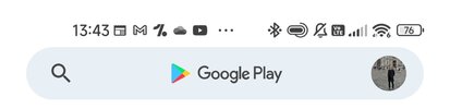
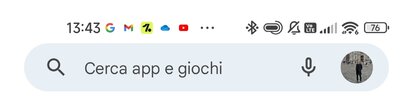
Hello everyone! We all know that since MIUI 12.5 Enhanced, MIUI set default status bar and notification icons as app launcher icons (colorful) while stock Android uses monochromatic icons in the status bar.
This option can be easily changed in settings > Notifications and control center > status bar > "Use app icons for notifications".
Since I'm very undecided in which option looks better i want to hear your thoughts!
Example of stock monochromatic and colorful icons can be found in the attachments.
This option can be easily changed in settings > Notifications and control center > status bar > "Use app icons for notifications".
Since I'm very undecided in which option looks better i want to hear your thoughts!
Example of stock monochromatic and colorful icons can be found in the attachments.