mclaude74 can't fix some translation, icon captions, so I'm writing to the team xiaomi.eu
regarding the application menu and desktop, the name of the applications in 2 lines, is it possible to do in 1 line? or add such an item to desktop > settings, of course the question is more to igor eisberg (I didn't tag you, just mentioned )
)
it turns out something like this "application menu" >
size max >
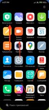
size stock >
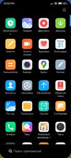
here, for example, the desktop, the default icon size, in 2 lines is not very...If you make the icons bigger to the maximum, the desktop will be in 1 line and the application menu will remain in 2 lines, like in the first screenshot.
size max >

size stock >
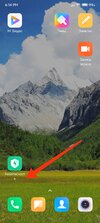
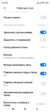
the best option, of course, would be to add settings like in this mod, "icon signature in 1 line" and "signature with a running line", but of course at the discretion of the project, if so, then we get 3 options for desktop signatures and a normal application menu. Well, or at least one "icon signature in 1 line" >
-------------------------------------------------------------------------------------------------------------------------------------------------------------------------
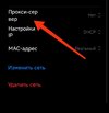
translation in russian does not match looks crooked, and no mclaude74 can't fix it without you. >
Settings > Wi Fi > select your network...
The correct meaning of the word
"Прокси сервер" ~ "Прокси-сервер" can still be called "Прокси" < (The same option as in English, a very good option)
in English, it's just a "Proxy"
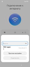
another 1 incorrect value, when first setting up in russian, if you select advanced wifi settings > "MAC-адрес" does not fit into the string
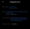
details of this screenshot 2 (Application name: settings), (this screenshot is the first launch of the system, setup in russian, I erased the Wifi name)
What is the spelling to shorten the name just write "MAC" or write that the name would fit into the string "MAC-адрес"
regarding the application menu and desktop, the name of the applications in 2 lines, is it possible to do in 1 line? or add such an item to desktop > settings, of course the question is more to igor eisberg (I didn't tag you, just mentioned
it turns out something like this "application menu" >
size max >

size stock >

here, for example, the desktop, the default icon size, in 2 lines is not very...If you make the icons bigger to the maximum, the desktop will be in 1 line and the application menu will remain in 2 lines, like in the first screenshot.
size max >

size stock >

the best option, of course, would be to add settings like in this mod, "icon signature in 1 line" and "signature with a running line", but of course at the discretion of the project, if so, then we get 3 options for desktop signatures and a normal application menu. Well, or at least one "icon signature in 1 line" >

-------------------------------------------------------------------------------------------------------------------------------------------------------------------------
translation in russian does not match looks crooked, and no mclaude74 can't fix it without you. >
Settings > Wi Fi > select your network...
The correct meaning of the word
"Прокси сервер" ~ "Прокси-сервер" can still be called "Прокси" < (The same option as in English, a very good option)
in English, it's just a "Proxy"

another 1 incorrect value, when first setting up in russian, if you select advanced wifi settings > "MAC-адрес" does not fit into the string
details of this screenshot 2 (Application name: settings), (this screenshot is the first launch of the system, setup in russian, I erased the Wifi name)
What is the spelling to shorten the name just write "MAC" or write that the name would fit into the string "MAC-адрес"


Last edited:

